This artifact presents a usability report analyzing the U.S. Department of Energy’s Office of Inspector General homepage. The project involved conducting a usability test with diverse users, synthesizing findings, and creating actionable recommendations to improve the website’s functionality and accessibility. Originally completed for a Principles of Technical Communication class, the report was later refined in my Design class to improve its visual presentation.
Goals
The goals of the project included:
- conducting a usability test to evaluate the effectiveness of a government website
- identifying areas of strength and weakness in design, accessibility, and user experience
- providing actionable recommendations for improvement based on user feedback
Objectives
The primary objectives of this project were to:
- evaluate the usability of the website’s homepage using structured methodologies
- synthesize findings into a clear and concise report for stakeholders
- propose recommendations to address usability challenges and enhance accessibility
Outcome
The project achieved the following results:
Detailed Usability Report
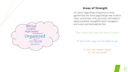
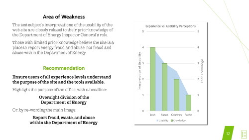
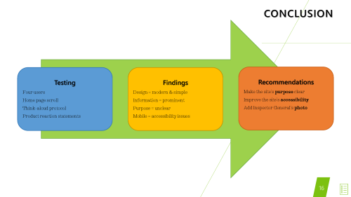
An analysis identifying key strengths (modern design, clear navigation) and weaknesses (unclear purpose, mobile accessibility issues).
Actionable Recommendations
Targeted suggestions to improve the user experience, such as resizing images for mobile devices and clarifying the site’s purpose.
Professional Deliverables
A polished report and presentation demonstrating the integration of user testing, technical writing, and design refinement.
Approach
Usability Testing
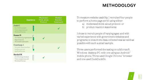
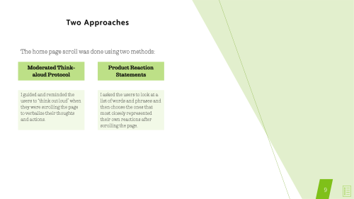
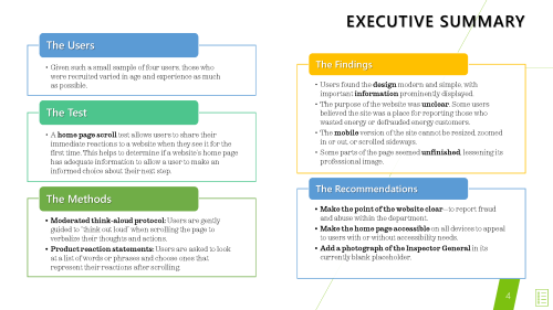
The usability test utilized two methods: moderated think-aloud protocol and product reaction statements. Four participants of varying ages and experience levels were recruited to evaluate the website’s homepage.
The test involved a “home page scroll,” where participants provided immediate reactions to the website’s layout, functionality, and purpose.
Analysis and Reporting
Findings were categorized into strengths and weaknesses, with recommendations tailored to address specific challenges.
The report was refined in Microsoft Word for clear structuring and visual hierarchy, and the accompanying presentation was created in PowerPoint for stakeholder engagement. In my Design class, further refinements improved the report’s visual appeal, including layout, typography, and data visualization.
The deliverable is a professionally formatted usability report presentation, refined in Microsoft Word and PowerPoint for clarity and visual appeal.
Final Deliverable
The final deliverable is a usability report presentation, submitted as a high-resolution PDF export for print and web formats.