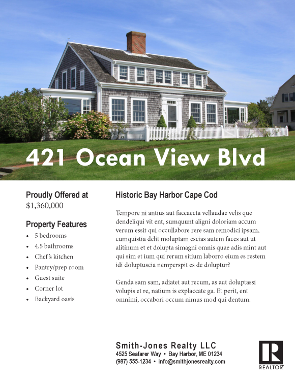
This project focused on redesigning a poorly designed real estate flyer to improve its usability and visual appeal. By applying C.R.A.P. principles (see explanation below) and designing on a grid, the deliverable achieved a professional, clear, and audience-focused layout.
Goals
The goals of the project included:
- identifying and critiquing a poorly designed flyer
- using principles of design and a grid structure to improve clarity, readability, and engagement
Objectives
The primary objectives of this project were to:
- identify and critique flaws in the original design
- apply C.R.A.P. principles to improve usability
- use a grid structure to create a balanced and professional layout
- maintain alignment with the intended audience’s expectations
Outcome
The project achieved the following results:
Professional Design
A polished, visually appealing real estate flyer.
Improved Readability
Clearer layout and effective use of typography for enhanced understanding.
Audience Alignment
A layout designed to meet the expectations and needs of the intended audience.
Design Proficiency
Demonstrated skill in applying C.R.A.P. principles and grid-based design.
Approach
The process began with analyzing the original flyer, focusing on elements such as color contrast, typography, layout, and information grouping. Using a C.R.A.P. critique template, key areas for improvement were identified.

I identified key areas for improvement by using C.R.A.P. principles—Contrast, Repetition, Alignment, and Proximity—core guidelines for effective visual design that improve readability, consistency, and hierarchy. The term was coined by designer and educator Robin Williams in her book The Non-Designer’s Design Book.
Next, a wireframe was created to outline the redesign on a grid structure. The redesign emphasized strong visual hierarchy, grouping related information (e.g., property details and contact information), and maintaining alignment for a polished look.
Adobe InDesign was used to implement the wireframe into a complete design, leveraging tools like color swatches and text alignment for precision. Peer reviews and feedback were incorporated to refine the deliverable.
Final Deliverable
The final deliverable is a redesigned real estate flyer high-resolution PDF export for print and web formats.